
Designing the Unboring Image: How to Keep Your Viewer’s Eye in Your Work
When I used to teach composition to illustration students, I could always tell when a piece was finished too early. The student would be somewhat satisfied, but the image itself would just sit there — technically fine, but a bit…boring. Something vital was missing: rhythm, tension, and that invisible current that keeps a viewer’s eye traveling through the space.
There are no real tricks to designing an engaging image — just solid principles of visual organization that tap into how humans instinctively perceive space and meaning. That’s really what composition is about: semiotics in action. The way we divide shapes, balance contrast, and direct movement across a page isn’t random—it mirrors how our psyches search for symbols, patterns, and story. Here are a few of my favorite principles—the same ones I return to again and again in my own work. And once you see them, you won’t be able to unsee them!
Pathways
A strong design often begins with an entry point — a pathway that allows the viewer to step into the image. Great landscape painters use winding roads or rivers to lead the eye, but illustrators can achieve the same through diagonals, flowing gestures, or directional light. Think of it as an invitation: “Come in, follow me.”
In Thomas Cole’s landscape here, the looping curve of the river is a striking design choice — so different from the predictable horizontal depiction we often see. Notice how it leads the viewer’s eye inward from the right toward the center, a circle right into the focal point. The tree in the left foreground acts like a visual gatekeeper, stopping the eye from escaping the scene and redirecting attention upward into the sky — where the impending storm gathers its power.

A landscape by Thomas Cole.
The Dancing Dark Shape
One of the oldest compositional strategies is organizing your area of greatest contrast around your focal point — what I like to call the dancing dark shape.
Contrast — light against dark, soft against sharp, warm against cool — creates visual drama. When handled skillfully, it holds the viewer’s attention exactly where you want it.
N.C. Wyeth was a master of this. In The Opium Smoker, the strongest lights and darks dance around the central figure, creating a rhythm that pulls the eye through the composition. The well-dressed businessman’s white collar and cuff glow against the shadowed figure, anchoring our focus on him. But look closely: the hand holding the pipe belongs to the other man. Wyeth gives this second figure equal contrast in the sleeve and hand — suggesting his power in the scene — while the rest of his body recedes into less focus. Notice how the sharp line of the sleeve acts as a divider between the two men and the Asian man’s figure casts a shadow on the other man like a pall— the dancing dark shape. The interplay of contrasts here becomes the storytelling.

The Opium Smoker by NC Wyeth.
Arrows
Compositions often contain hidden arrows — shapes, gestures, and lines that point toward the subject of interest. A sword, a tree branch, a cast shadow, even the tilt of a gaze — all can act as directional forces guiding the viewer to what matters most.
When arranged intentionally, these arrows create visual tension and momentum, giving your image a sense of purposeful direction.
In N.C. Wyeth’s One More Step, Mr. Hands, every major line points toward the central tension between the two figures. The composition hums with anticipation — it’s the charged moment before any action takes place. You can feel the threat, the breath held. To know what happens next, you must turn to the story, but the image itself is a masterclass in suspense built from direction and intent. Notice too, the red warning sign — the sash on the man with the knife grabs your attention. Is he the greater threat?
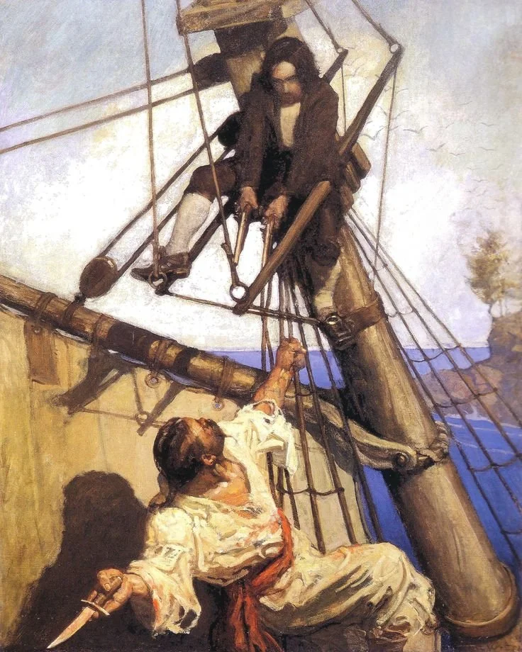
One More Step, Mr. Hands, NC Wyeth.
Flags
A “flag” is a burst of bright or highly saturated color strategically placed to draw the viewer’s eye. Think of it as a flare of emphasis — a pop of red scarf in a muted world, or a shaft of golden light striking a single object.
Flags work best when used sparingly. Too many, and they begin to compete. Used wisely, they’re irresistible signals.
In Edwin Austin Abbey’s Richard, the Duke of Gloucester and Lady Anne, the flash of red functions as both a visual magnet and a symbol of danger. Notice the areas of highest contrast: Lady Anne’s illuminated face and the glint of light on the Duke’s sword. The staves of the funerary procession all point toward her — acknowledging her importance but also underscoring the Duke’s looming threat. His upward-pointing sword breaks expectation, heightening the tension of the scene.

Edwin Austin Abbey— Richard, The Duke of Gloucester and the Lady Anne.
Doorstops
Sometimes, you don’t want your viewer to leave too quickly. That’s where doorstops come in.
These are compositional elements that keep the eye from “sliding” off the edge of the picture. They form subtle barriers that redirect attention back into the space — a tree trunk, a foreground shadow, or a vertical column. Placed with care, they anchor the composition and keep the eye circling within.
Cézanne’s Still Life with Skull demonstrates this beautifully. The white cloth serves as a pathway; the warm red-orange fruit centers the composition; and the strongest contrasts — the dark shadows and brightest whites to the left — draw the viewer toward the skull. The doorstops are quiet but deliberate: the hanging fabric in the upper right, the horizontal line of the tabletop reconnecting and pointing to the cloth, and the dark patch of foliage on the left. Each keeps the eye from drifting away, guiding it instead toward the dark weight at the image’s heart.
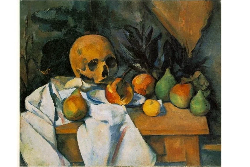
Still Life With Skull by Paul Cezanne.
Soft Focus vs. Sharp Focus
Human eyes can only focus on one thing at a time — and your composition should reflect that truth.
Keep your focal area sharply defined while letting other parts of the image soften or blur slightly. This natural hierarchy of clarity directs the viewer’s attention and enhances depth, separating subject from background. Your secondary areas don’t need excessive detail to have presence — often, a silhouette or suggestion speaks more eloquently.
In Thomas Blackshear’s Swan Song, the distant swans dissolve into soft focus, emphasizing the crisp intersection where the figure’s headdress meets the bright sky — the area of greatest contrast and saturation. The upward flight of the swans echoes his gaze, building a shared movement that evokes transcendence and spiritual heightening.
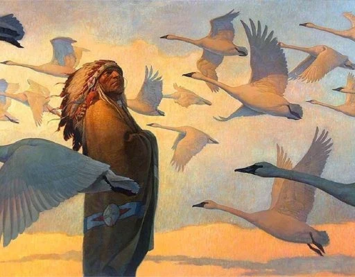
Thomas Blackshear’s Swan Song.
Cropping
Sometimes what you omit says more than what you reveal. Cropping a foreground element can add psychological tension and immediacy, placing the viewer inside the scene rather than observing from a distance — as if they’ve stumbled upon a moment mid-story.
Jenny Saville’s Prop is a striking example. The figure’s folded legs and cropped composition turn the massive knee into a sculptural form of its own, grounding the image in weight and tension. She appears both suspended and burdened — her body draped over the chair is powerful. The body’s shadowed side against the negative space enhances the sense of gravity and introspection. It’s visceral storytelling through the edges of the frame.

Prop by Jenny Saville.
Strange Perspectives
Perspective can be bent toward meaning. A low or high viewpoint, a tilted horizon, or an impossible vantage point can all stir curiosity and unease.
Strange perspectives make us aware that we’re not neutral observers — we’re seeing through someone’s eyes. These distortions often carry narrative tension; they let emotion shape the space.
In this aerial landscape by Moebius, the viewpoint is ambiguous — is it another module’s gaze or a bird’s? The bright color of the craft pops against the muted ground below. The river winds like a navigational line, dividing the composition and implying movement. The brightest reflection on the sphere becomes the focal contrast, while the diagonal thrust of exhaust and the bird’s flight path weave together in rhythmic harmony.
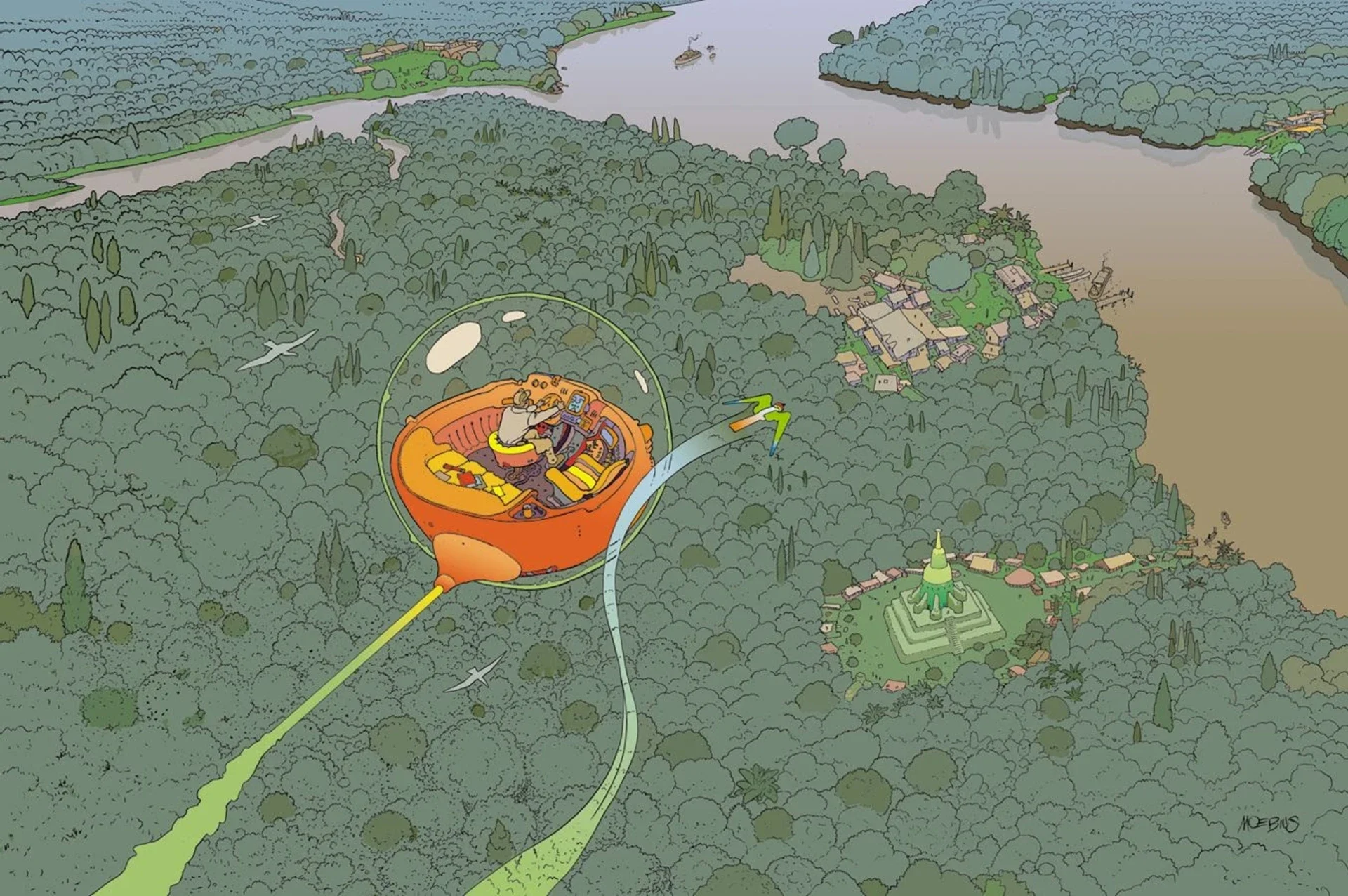
Blade Runner, Moebius.
In the End
In the end, design is simply problem-solving with elegance in mind. Whether I’m working in paint, pencil, or clay, I’m always asking the same questions: Where does the eye enter? Where does it rest? What makes it want to stay?
These ideas—pathways, contrast, balance, rhythm—are timeless because they echo how our subconscious organizes the world. They’re how the psyche recognizes harmony or dissonance, tension or release. Good design doesn’t just look right—it feels right, because it’s speaking to something deep and preverbal within us.
Of course, this isn’t a complete list—just a few of the tools I lean on most. If there’s a design element you rely on or think should be added here, I’d love to hear about it in the comments. After all, the language of images is one we’re all still learning to translate.
If you liked this article, you might also like these:
On How to Critique Artwork Objectively