I. The cartouche
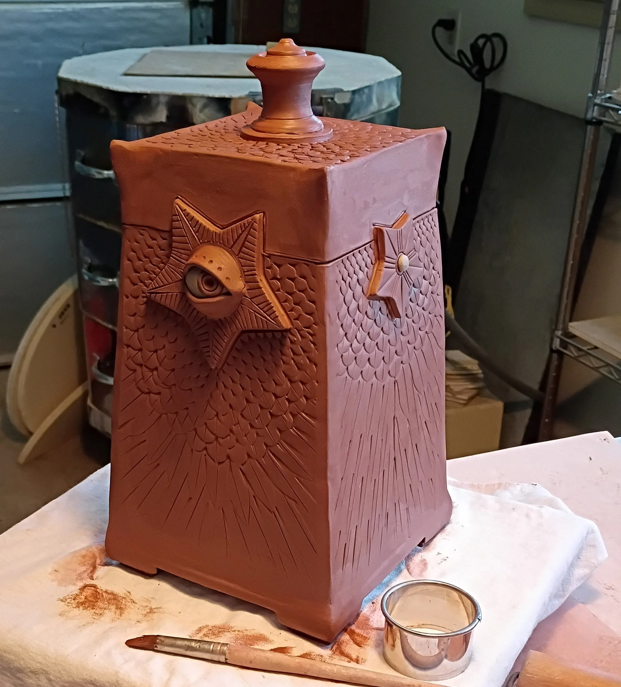
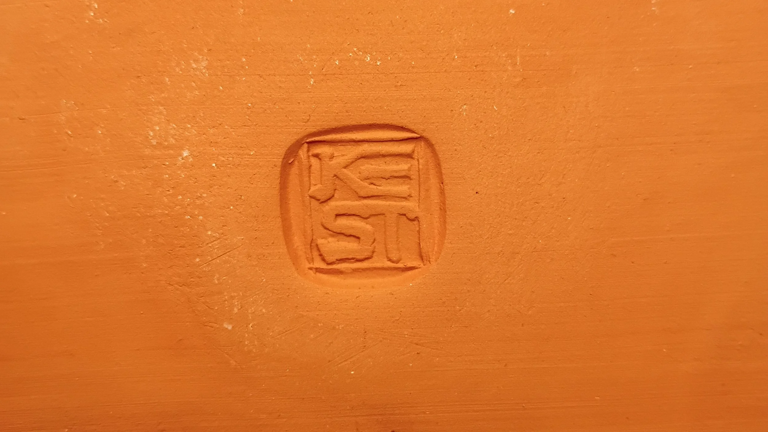
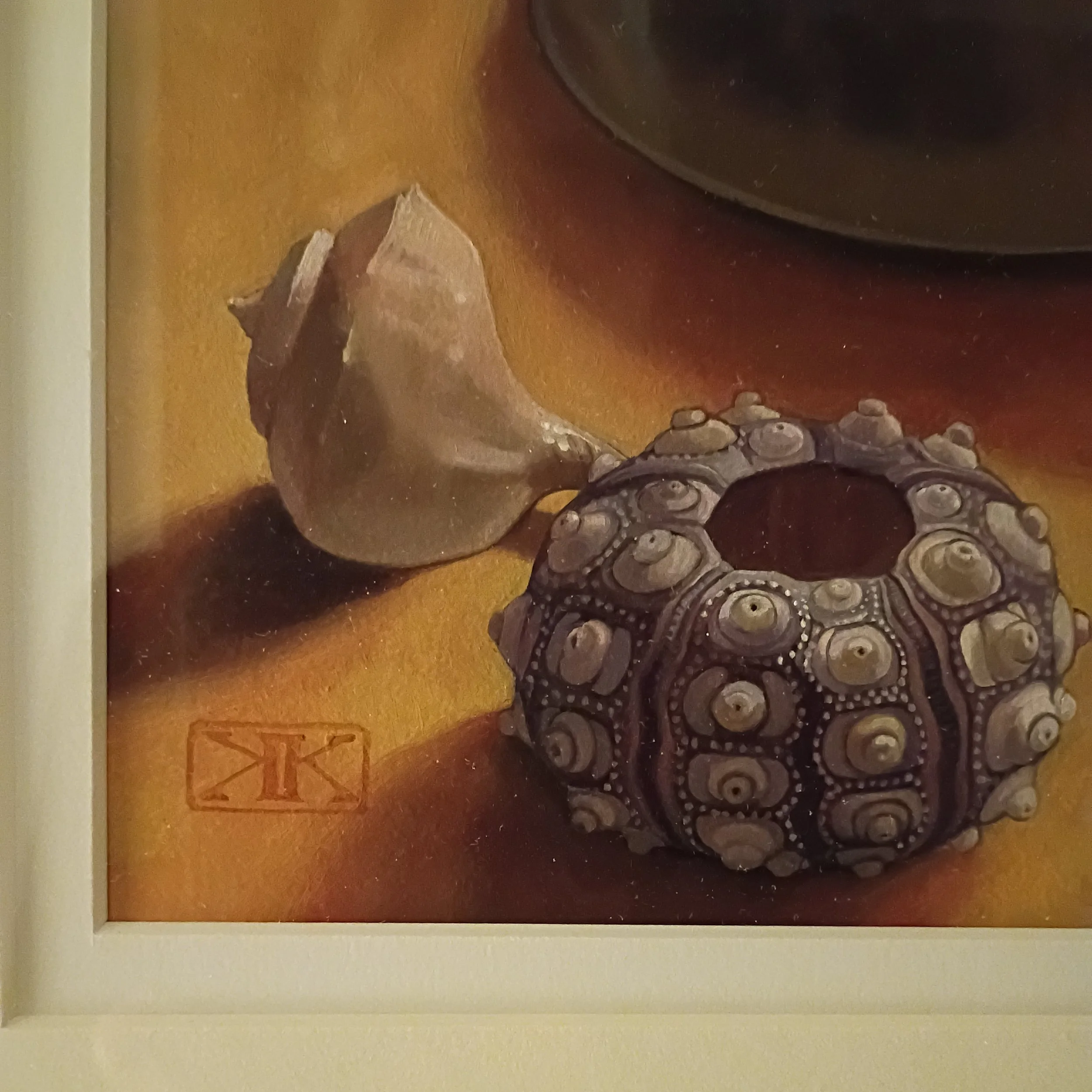
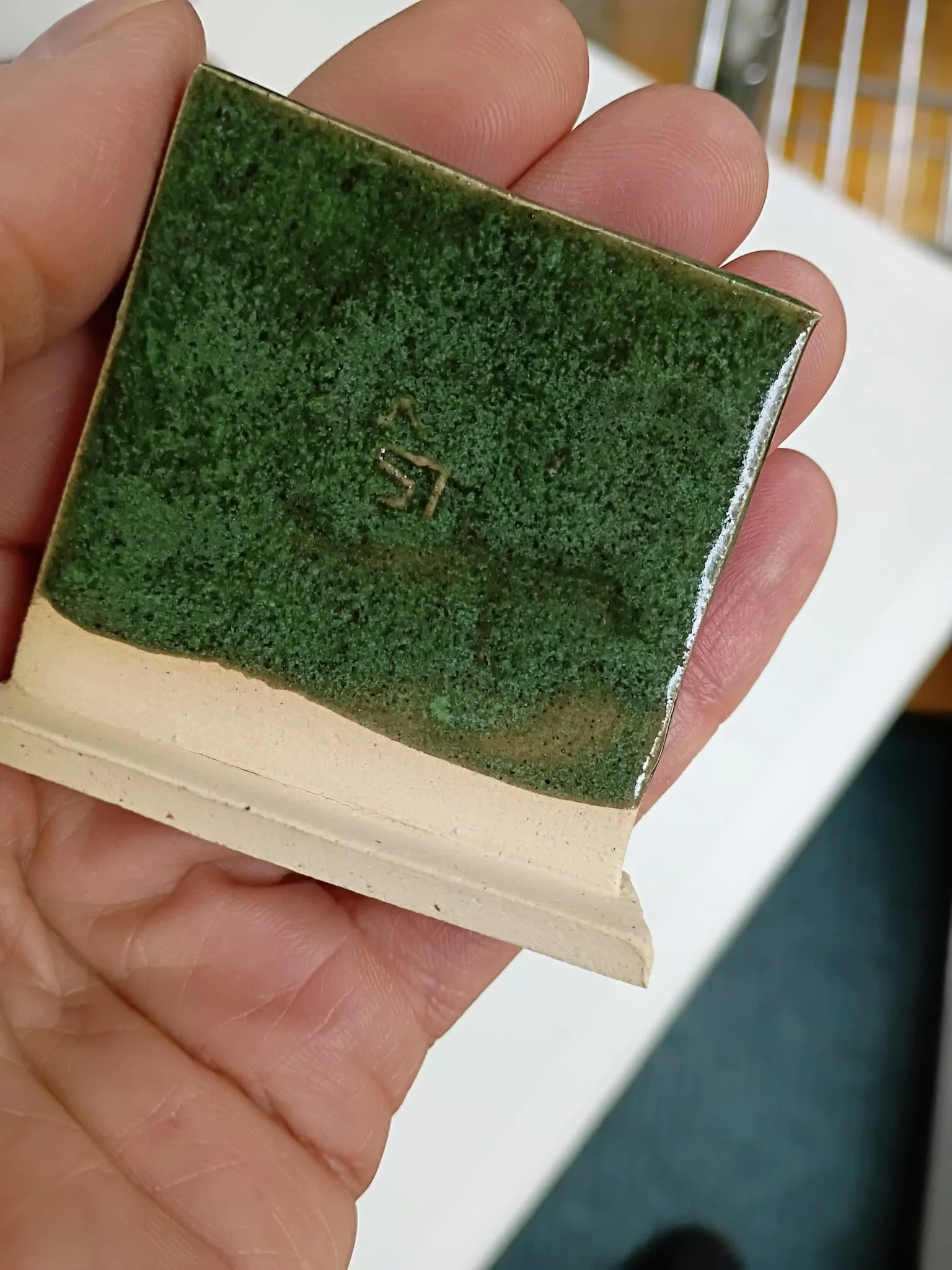
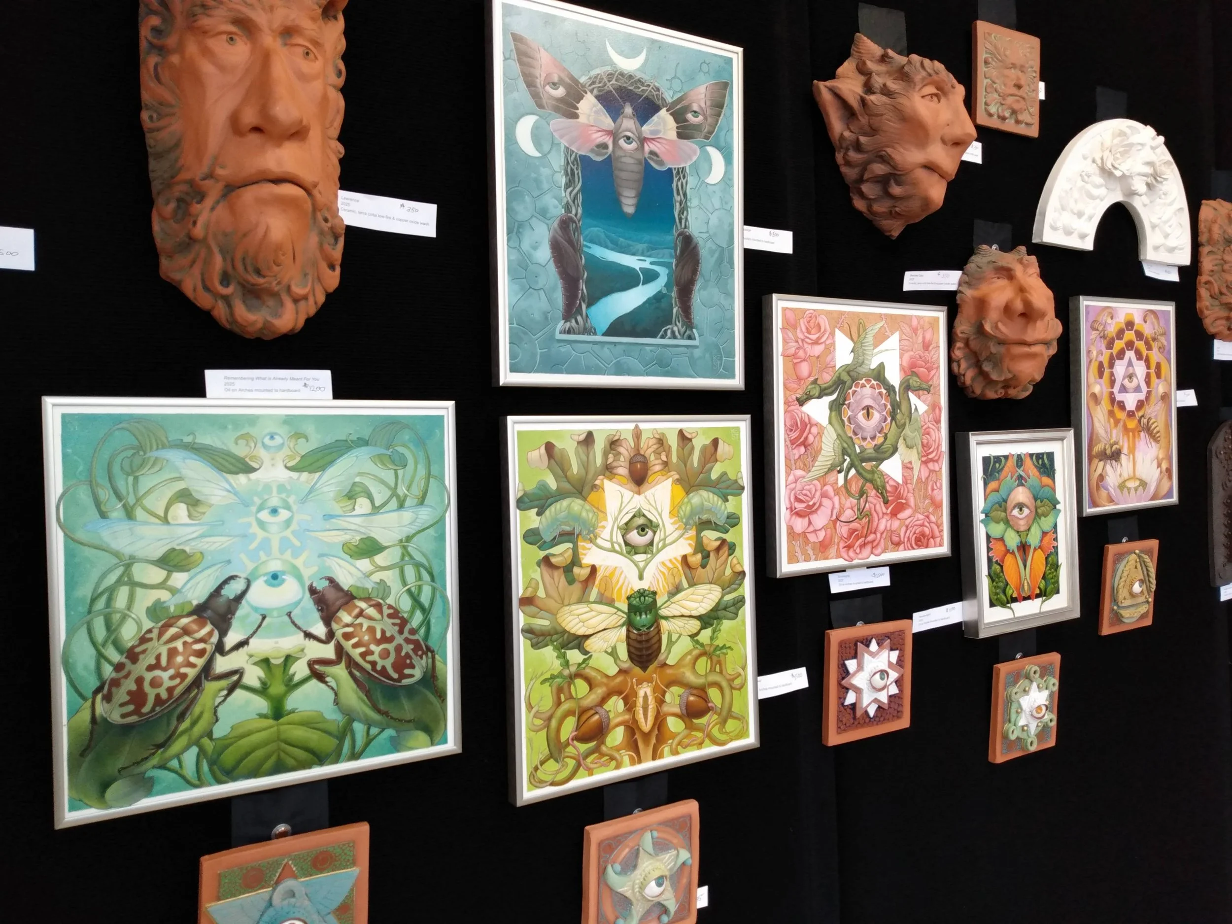
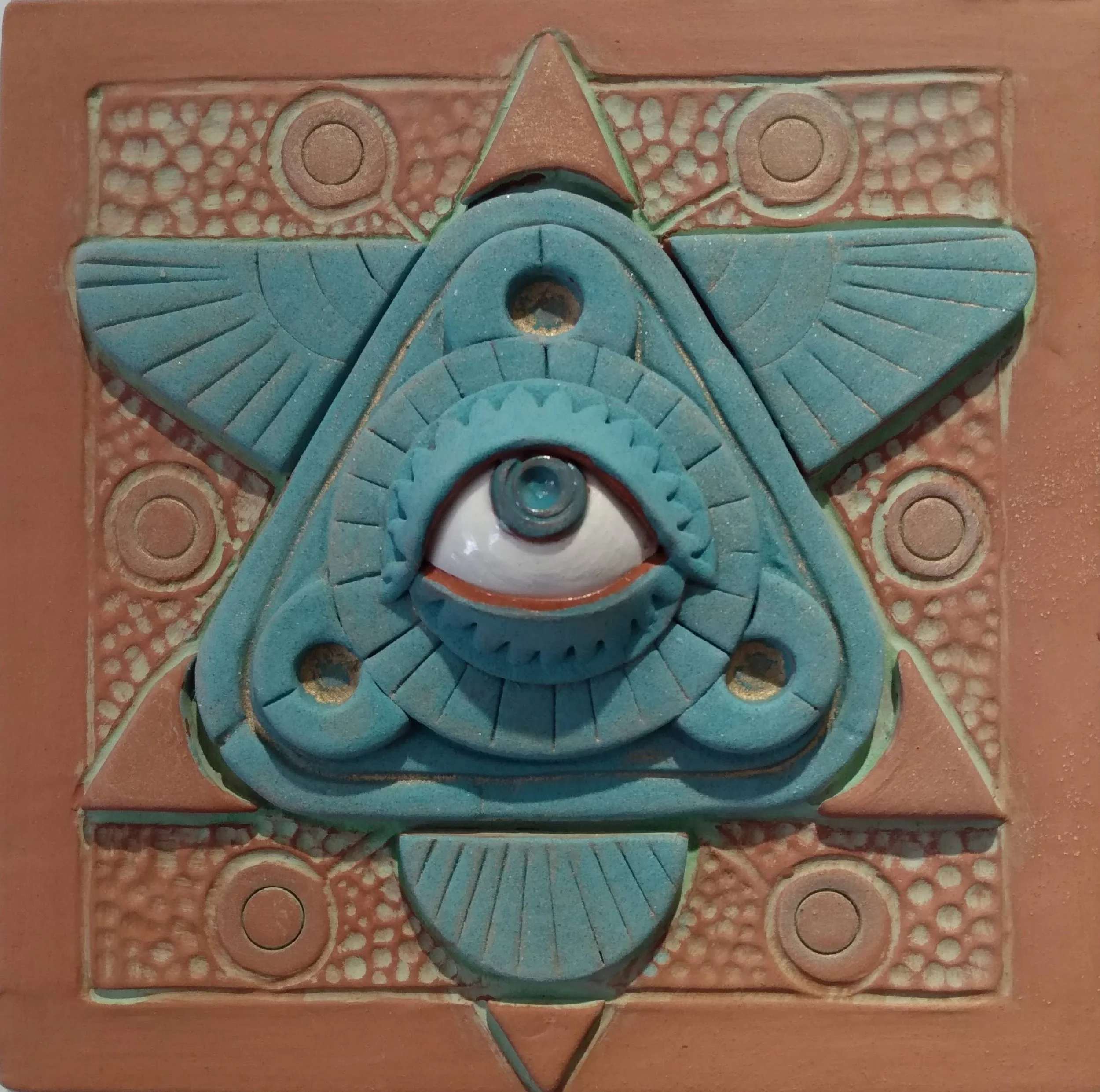
Originally, the pharaoh's name was enclosed in an oval — a cartouche meant to encircle and protect the divine king's identity for eternity. Mine has a simpler meaning. The square cartouche of KEST that appears on my pottery and on my paintings mainly highlights the object's handmade quality. A human made this thing. One person, with a name.
You may be curious when and why that name changed. I was always the person who was going to change her name — I knew it from the time I was in my single digits. My father's family name was old world, difficult to pronounce, more difficult still to spell, and I had tired of explaining it over and over across every phone call and transaction that required it. Kest is easier — to say, to spell — and it has a snappiness that I always enjoyed in short last names.
At age 19, I walked into an attorney's office with a check for $400. Three months later, my name was changed in court. I had the middle name struck as well. Such audacity.
I didn’t tell my father's family beforehand. My mother thought I should. But I was over 18, paying my own way through art school, working a full-time factory job, owning a vehicle, renting an apartment — fully adulting, as one might say now. In 1988, a person could actually afford to do all of that simultaneously, which tells you something about both the economy and my stubbornness.
II. The evolution of the mark
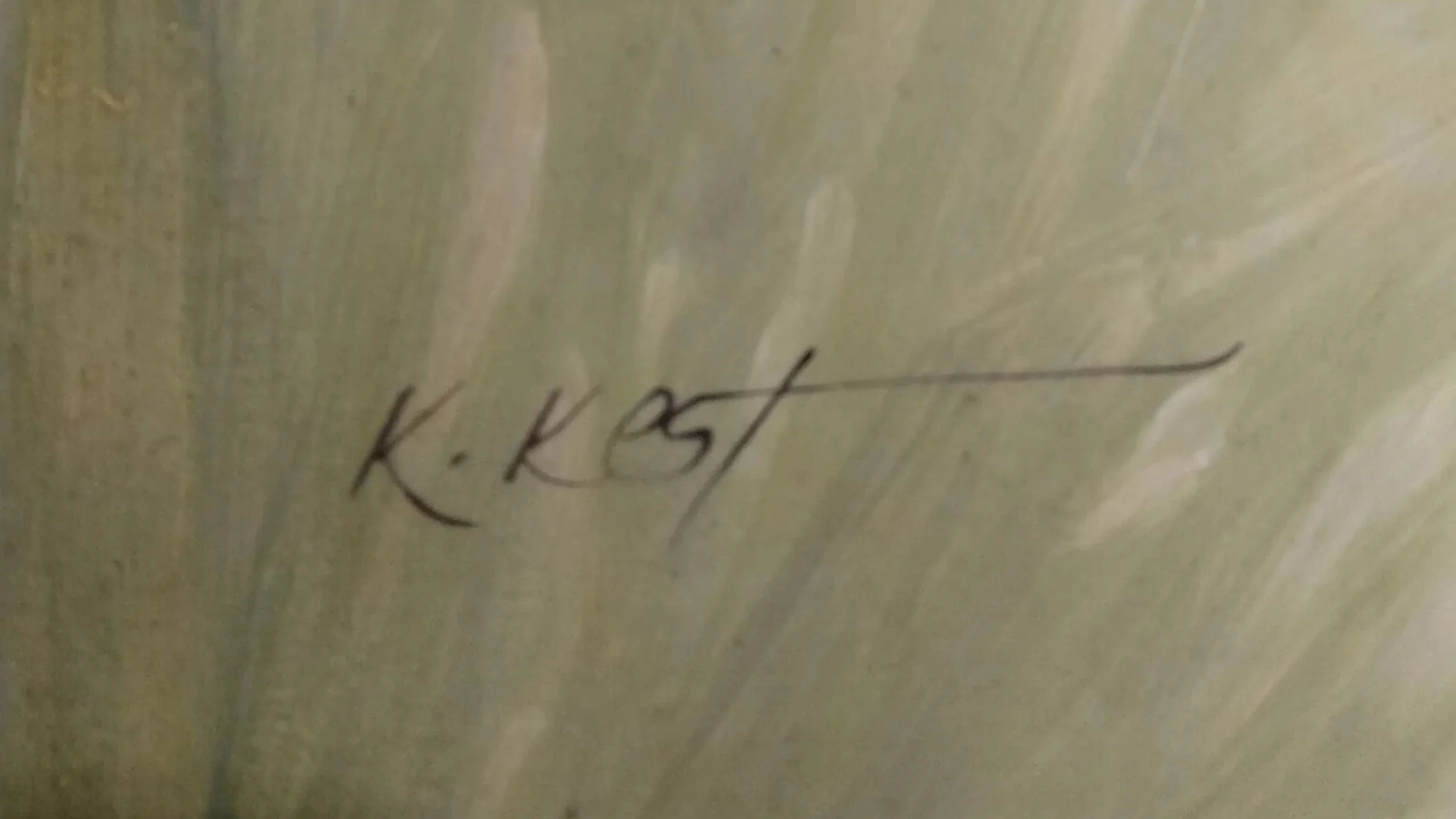
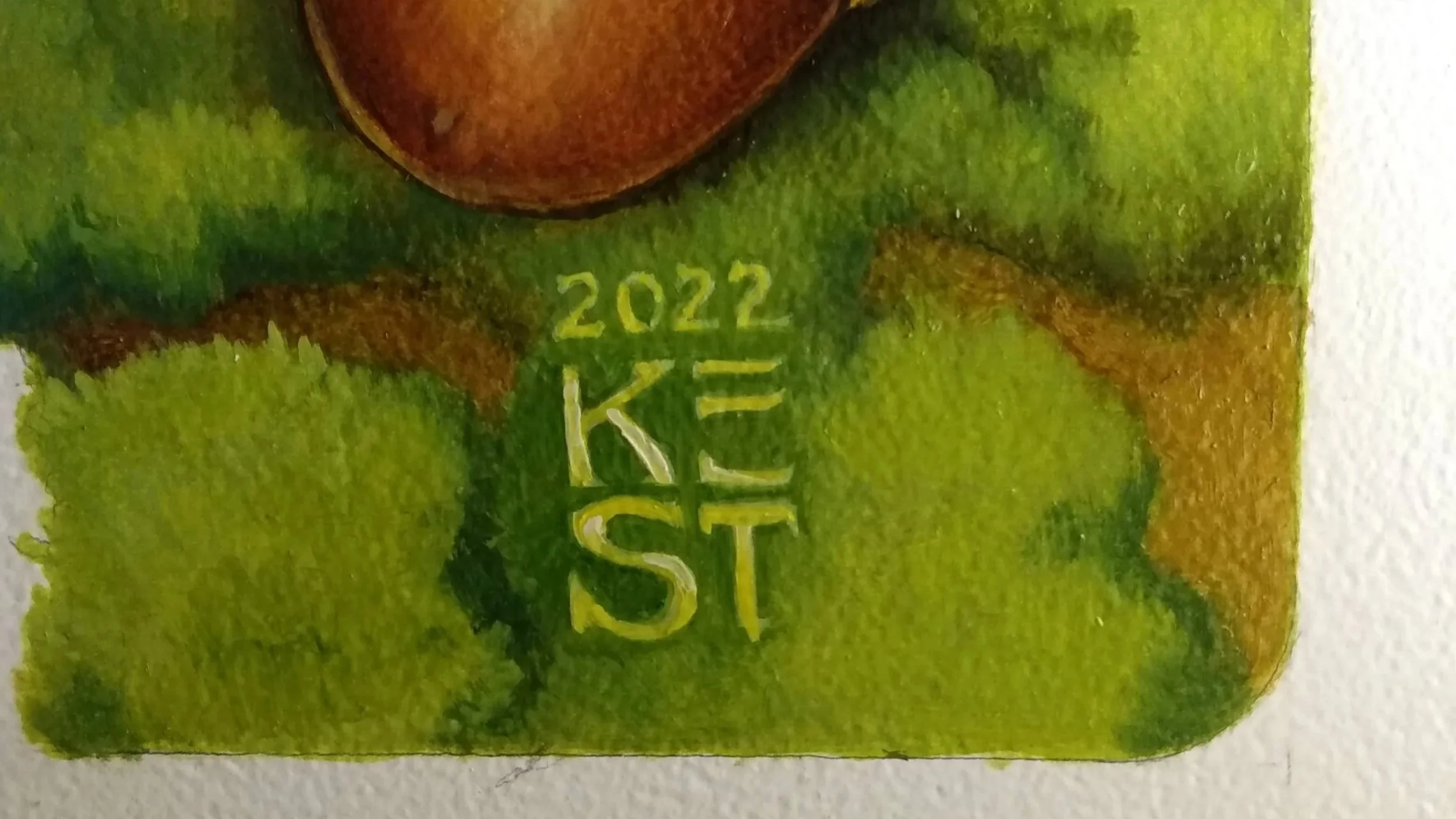
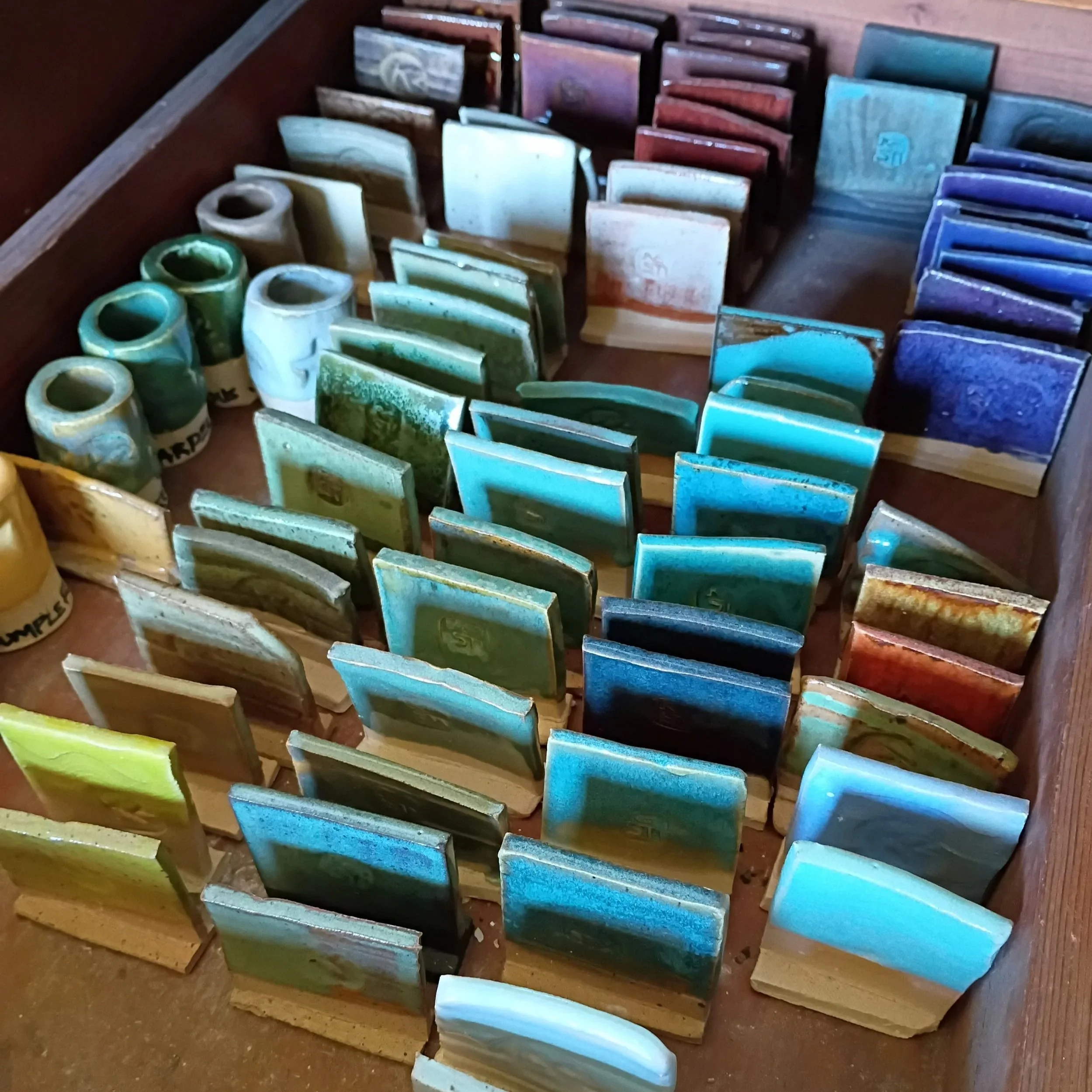
Before any published books, long before any pottery or sculptural work came into being, my original mark was a simple script signature: Kest. When I began working as a freelance illustrator, it was cleaner to develop a proper cartouche — two K's set back-to-back inside a rectangle. All straight lines, easy to render cleanly on book covers and fine art pieces. Thirty children's books and several years into a boutique pottery practice, I was still using that mark.